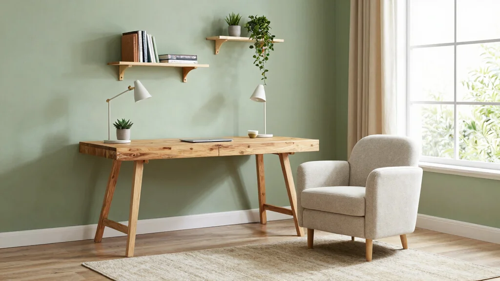
Creating a study room that strikes the perfect balance between energy and calm can feel like a daunting task. When surrounded by the right colors, your mind can feel more focused and inspired. I crafted this post to help you explore various study room color ideas that not only enhance productivity but also promote a sense of tranquility. After all, your study space should be a sanctuary for both learning and relaxation.
If you’re someone who spends a lot of time in your study or home office, this guide is tailored just for you. Whether you’re a student preparing for exams or a professional working from home, the colors in your space significantly impact your mood and productivity. You’ll discover a collection of color schemes that are not only beautiful but also functional, allowing you to create an ideal environment for concentration and creativity.
In this post, you’ll find twelve thoughtfully curated color ideas that balance energy and calm. From soft hues that soothe to bold shades that invigorate, I’ve gathered options that cater to your personal style and needs. Get ready to embrace calming paint colors for study and home office color inspiration that will uplift your workspace and enhance your efficiency.
Key Takeaways
– Choosing the right study room color schemes can influence your focus and creativity, so select shades that resonate with your work style.
– Calming paint colors for study, such as soft greens and muted blues, promote concentration and reduce stress.
– Energetic color combinations, like yellows and oranges, can inspire motivation and enthusiasm, making them ideal for brainstorming areas.
– Incorporating natural elements into your color choices, such as earthy tones, can enhance your connection to nature and boost your mood.
– Balancing colors for productivity means mixing vibrant shades with calming tones, creating a harmonious environment for both work and relaxation.
Recommended Products

Floral Design: Neutral white, cream, pink, and orange blooms
1. Soothing Sage Green
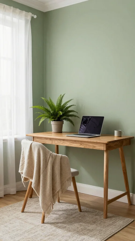
Sage green is a tranquil hue that effortlessly invites the essence of nature into your study room. This gentle color promotes mental clarity and calmness, making it an ideal choice for a focused workspace. Pair it with warm wood accents or crisp white furniture to establish a soothing yet stylish environment that encourages productivity.
To make the most of sage green, consider practical ways to enhance its impact. Use budget-friendly options like paint or inexpensive shelving to introduce this color. Incorporating plants can further connect your space to the outdoors and contribute to a fresh atmosphere.
Consider these tips for your sage green study room:
– Pair sage-painted lower cabinets with open oak shelving.
– Install butcher block countertops alongside painted islands.
– Use walnut handles on green cabinet doors.
This color choice not only creates a visually appealing space but also fosters a peaceful mindset, enhancing your ability to concentrate.
Recommended Products

CONVENIENT SIZE - This Apple Barrel Acrylic Paint comes in a versatile 2 oz size that is great for basecoating, stenciling, and so much more

CONVENIENT SIZE - This Apple Barrel Acrylic Paint comes in a versatile 8 oz size that is great for basecoating, stenciling, and so much more

VERSATILE PAINT - These artist-quality acrylic paints are rich and creamy and are perfect for basecoating, stenciling, and more. This color comes in a convenient 2 oz size
2. Breezy Sky Blue
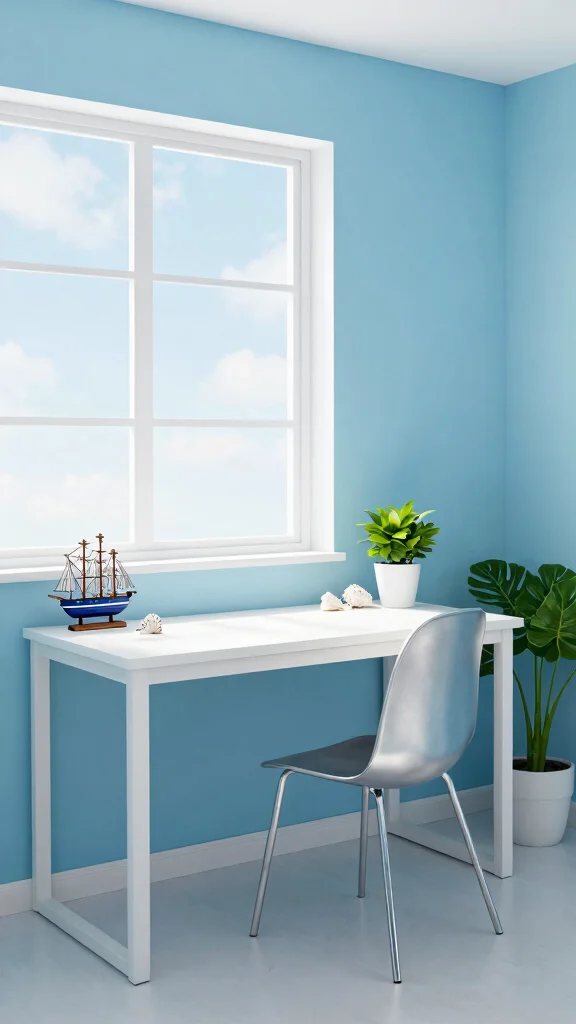
Sky blue offers a refreshing touch that mirrors the tranquility of a clear day, making your study room feel energizing yet calm. This soothing color helps alleviate stress and boosts concentration, creating an ideal backdrop for productivity. Combining sky blue with white or soft gray furnishings creates a modern, clean aesthetic that feels airy and spacious.
To effectively implement sky blue in your study area, opt for budget-friendly paint options or decor items that reflect this hue. Adding touches of greenery can also amplify the calming effects this color brings to your workspace.
Here are some ways to incorporate sky blue:
– Pair with crisp whites for a clean, airy feel.
– Incorporate navy accents for a striking contrast that adds depth.
– Use silver or metallic accessories to brighten the room.
By embracing sky blue, you create not just a visually appealing space but also one that uplifts and motivates you to engage with your work.
Recommended Products

Whimsical Design, Soft Touch: Featuring cute cloud shape and flocking finish, TEIPAI irregular wall mirror not only brings a magical, modern aesthetic to your walls, but adds a cozy, high-end feel. Real glass mirror delivers clear and distortion-free imaging, hanging it on porch, entryway or staircase to give a welcoming vibe and make your room look bigger

1. Home Decor Artwork Size: 16x24inch(40x60cmx1pcs),Frameless Posters, perfect gift for friends and family.
Breezy Sky Blue
Editor’s Choice




3. Warm Earth Tones
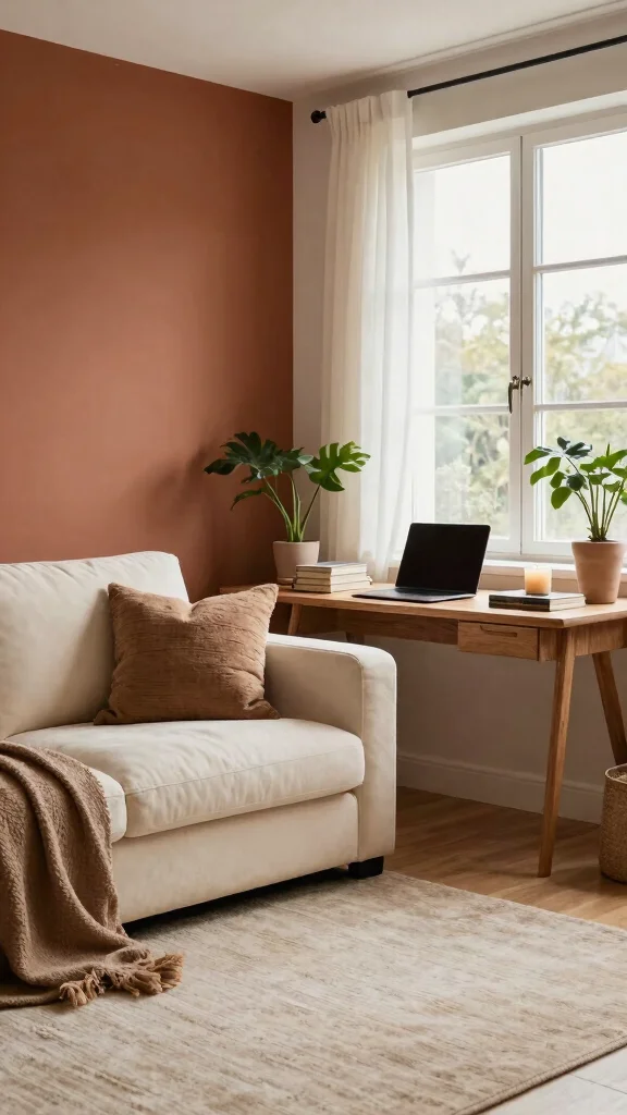
Warm earth tones such as terracotta, rust, and muted browns establish a cozy and inviting atmosphere in your study room. These colors evoke a sense of comfort, fostering creativity and focus. By blending these shades with soft textiles and rich textures, you can craft a harmonious environment that encourages productive study sessions.
To integrate earth tones into your design, consider using budget-friendly paint or fabric options that evoke warmth. Layering various materials can enhance the depth and comfort of the space, making it a cozy retreat for studying.
Explore these ideas for using earth tones:
– Choose terracotta for an accent wall and complement it with beige or soft cream furnishings.
– Layer different textiles, such as a chunky knit throw and a plush rug, for depth.
– Use wooden elements to enhance the natural feel.
This color palette not only creates an inviting study atmosphere but also nurtures a productive mindset, making studying a more enjoyable experience.
Recommended Products

Custom Design Fabric:Each package includes 2 panels of pinch pleated curtain with 18 hooks and 16 rings,measuring 40"Wx84"L each panel,To reduce budget while keeping the linen/cotton organic characteristics,Designer makes this stone washed ultra soft yet linen look blended fabric 20% cotton,20 linen,60% polyester.It drapes well,medium thick,airy and breathable in hot summer

Premium Wallpaper Specifications & Material:This luxury wallpaper measures 17.7×118 inches, crafted from high-grade self-adhesive vinyl. The removable wallpaper features a matte, textured finish that enhances the depth of its dark-toned design, with waterproof and scratch-resistant properties for durable wall decoration in dry interior spaces.
Premium Wallpaper Specifications & Material:This luxury wallpaper measures 17.7×236 inches, crafted from high-grade self-adhesive vinyl. The removable wallpaper features a matte, textured finish that enhances the depth of its dark-toned design, with waterproof and scratch-resistant properties for durable wall decoration in dry interior spaces.
Warm Earth Tones
Editor’s Choice



4. Soft Lavender

Soft lavender is a calming color that balances tranquility with a touch of vibrancy, making it an excellent choice for a study room. This gentle hue helps reduce stress while keeping your mind alert and engaged. Pairing lavender with white or warm grays creates a soothing workspace that inspires creativity.
To effectively style a lavender study room, consider layering various shades of lavender through fabrics and accessories. Using light, airy curtains can enhance the sense of space while incorporating gold accents adds a touch of elegance.
Use these styling tips for your lavender space:
– Layer fabrics in varying shades of lavender for a monochromatic look.
– Use airy white curtains to enhance the lightness of the space.
– Combine with gold accents for a touch of elegance and warmth.
Creating a lavender study room fosters a calming yet energizing environment, making it perfect for brainstorming or studying.
Recommended Products

Blue Moon Dreams - This blue monochromatic shadow palette are what dreams are made of. With its unique range of blue shadows in matte, metallic, and duochrome finishes, this palette gives you the creative edge to make any look you want.

SPECTRUM OF SHADES – A curated mix of matte, shimmer, and metallic finishes ranging from soft mint green, bright blue and icy aqua, to deep teal, midnight navy and silver. The palette is designed to capture the full depth of water tones, letting you create looks that are both fresh and dramatic.
Soft Lavender
Editor’s Choice


5. Energizing Yellow

Yellow is a vibrant, cheerful color that can instantly elevate your mood and invigorate your study space. A sunny yellow accent wall serves as a focal point that stimulates creativity while maintaining a warm atmosphere. To maximize this effect, pair yellow with neutral tones or soft blues to create a balanced, inviting environment.
To effectively use yellow in your study room, consider adding it in smaller doses to avoid overwhelming the senses. Incorporating gray or soft blue can provide a calming counterbalance, helping you stay focused and inspired.
Implement these best practices for using yellow:
– Use yellow in small doses to avoid overstimulation.
– Pair with gray or soft blue for a calming counterbalance.
– Incorporate playful accessories like colorful desk supplies for added fun.
This energetic hue can transform your study room into a vibrant workspace that inspires creativity and focus.
Yellow sparks focus—without shouting. If you’re exploring study room color ideas, start with a soft yellow accent and pair it with gray or soft blue to keep energy balanced. Add it gradually with accessories, and watch mood and motivation rise.
Recommended Products

Ideal for use on interior/exterior surfaces including wood, plastic, plaster, metal, masonry and unglazed ceramic

Boho Abstract Wall Art: This set of 3 unframed posters comes in 12x16in and 16x24in.
Unframed Prints: Watercolor wall art prints - (Set of 3) - Unframed - 12x16 inches.
Key Trade-offs & Our Top Pick
Soothing Sage Green
– Pros:
– Promotes tranquility and focus, ideal for deep study sessions.
– Pairs well with natural wood accents for an eco-friendly vibe.
– Cons:
– May feel dull in low-light environments.
– Can be overwhelming if overused on all walls.
– Best for: Those looking to create a calming space that enhances concentration.
Breezy Sky Blue
– Pros:
– Evokes a sense of openness and fresh air, making the room feel larger.
– Excellent for reducing anxiety and boosting creativity.
– Cons:
– Might clash with warmer tones in furniture.
– Can feel cold if not balanced with warmer decor elements.
– Best for: Individuals who need a refreshing backdrop that inspires new ideas.
Energizing Yellow
– Pros:
– Brightens up the room and boosts mood instantly.
– Encourages creativity and positivity, great for brainstorming sessions.
– Cons:
– Too much yellow can be overwhelming and cause strain.
– Requires careful pairing with other colors to avoid chaos.
– Best for: Creative minds looking for a lively workspace.
Gentle Peach
– Pros:
– Soft and warm, it creates a welcoming atmosphere.
– Works well with both modern and traditional decor.
– Cons:
– May not provide enough contrast if the accents are also warm.
– Can feel too soft for those who prefer a bolder look.
– Best for: Anyone wanting a cozy, inviting study room.
Classic Gray
– Pros:
– Timeless and versatile, fitting almost any decor style.
– Creates a sophisticated backdrop that allows other colors to shine.
– Cons:
– Can feel cold or uninviting if not paired with warm accents.
– Might be too neutral for those wanting a lively space.
– Best for: Individuals who prefer a minimalist aesthetic with adaptability.
Best Overall: Soothing Sage Green
Soothing Sage Green stands out as the top choice because it strikes a perfect balance between calmness and energy. ✔ It enhances focus while still providing a refreshing ambiance. This color is easy to blend with various design elements, making it versatile for different styles. Plus, it adds a touch of nature that promotes a healthier environment, ideal for long study sessions. 🌱
Why We Picked This:
While Soothing Sage Green is our pick, some may prefer Energizing Yellow for a more vibrant space or Classic Gray for a sleek look. Your choice should depend on the type of energy you want in your study room. Consider your personal style, the amount of natural light, and what inspires you most. 🌈
Recommended Products

CONVENIENT SIZE - This Apple Barrel Acrylic Paint comes in a versatile 16 oz size that is great for basecoating, stenciling and so much more

VERSATILE PAINT - These artist-quality acrylic paints are rich and creamy and are perfect for basecoating, stenciling, and more. This color comes in a convenient 2 oz size

📦Packing list: You will receive 4 ceiling lamp shades, the size is 4x2 feet, which can meet your daily use and replacement needs.
6. Gentle Peach
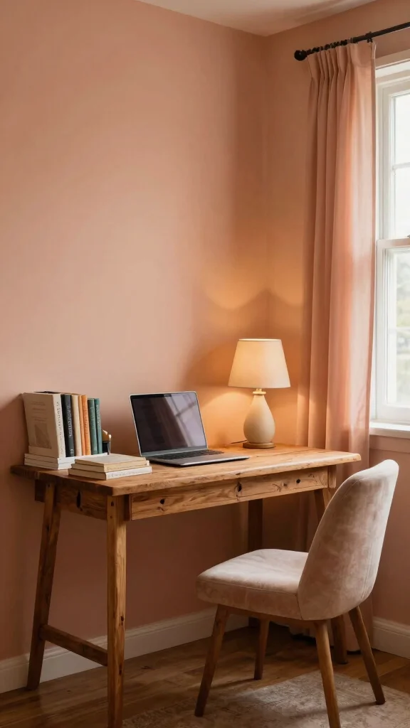
Gentle peach is a soft, inviting color that creates a warm and comforting atmosphere without being overpowering. This hue nurtures a sense of calm, making it perfect for extended study sessions. By combining peach with warm whites and light wood, you can achieve a fresh and uplifting look that feels cozy and inspiring.
To incorporate peach into your study room, consider using it as a primary color while accenting with cream or soft beige for a serene vibe. Adding wooden elements can ground the palette, enhancing the overall warmth of the space.
Here are some peach pairing ideas:
– Use peach as a primary color and accent with cream or soft beige for a serene vibe.
– Add natural wooden elements to ground the colors.
– Incorporate soft textile accents like cushions and curtains for added warmth.
Gentle peach is a subtle yet impactful color choice that ensures your study room remains cozy and inspiring.
Recommended Products

【ORANGE WALL ART 】Featuring 2 prints (11x14”), 3 prints (8x10”), and 4 prints (5x7”), totaling 9 pieces in various sizes. These orange artworks are perfect for housewarming gifts or gallery decoration.

Chic Design, Soft Touch: Bring modern elegance and tactile luxury to your home. This funky decorative mirror features a soft, velvet-like flocked finish that feels as special as it looks. Its stylish wavy design adds artistic character and instant charm, making it a standout accent for lovers of bold, unique decor

Natural Linen & Solid Wood Frame:This wall art measures 12x16 inches (approximately 30x40 cm),Set of 1 perfectly sized for various interior spaces,Made of natural linen,pattern is clear and durable.The clear wood grain and smooth touch of the solid wood frame make this vintage boho decorative painting more warm and rustic, which is the best choice for your high-quality life.
You might also like
7. Cool Mint Green

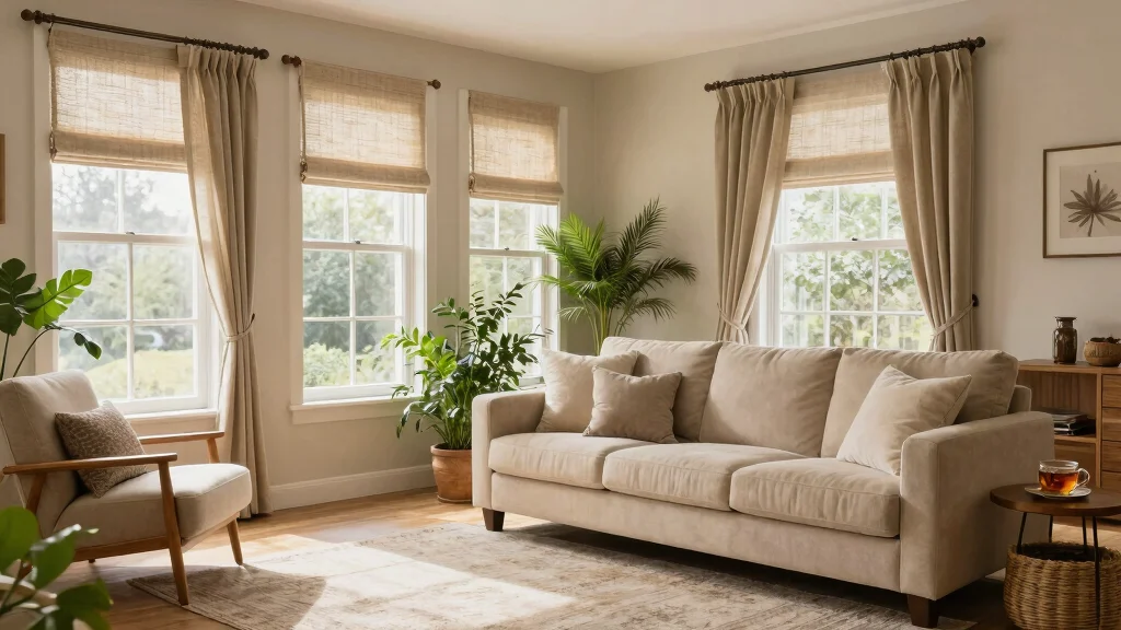
Mint green is a refreshing and invigorating color that brings a sense of tranquility to your study room. This uplifting hue allows you to remain calm and focused while working on tasks, making it an excellent choice for a productive environment. Mint pairs beautifully with whites, light grays, and even subtle pinks for a fresh, modern appeal.
To effectively use mint green in your study space, consider it as an accent color for furniture or wall art. Combining it with gray or white creates a sleek and contemporary feel that keeps the atmosphere lively and inviting.
Here are some mint green essentials:
– Use mint as an accent color for furniture or wall art.
– Combine with gray or white for a sleek, contemporary feel.
– Incorporate colorful desk accessories to keep the energy lively.
This color will enhance your study environment, instilling a refreshing vibe in your work routine.
Fun fact: Mint green walls can boost focus by up to 18% for longer study sessions. As part of study room color ideas, pair it with white and gray for a calm, eco-friendly space that keeps you productive and inspired.
Recommended Products

Natural Desert Palette with Earthy Charm: Incorporating muted browns greens and terracotta this set features layered arches and plant silhouettes for a rustic grounded feel Fits beautifully with boho western or neutral toned rooms

Cottagecore Wall Decor Poster: Bring a touch of whimsy to your space with this cottagecore wall decor poster set, perfect for creating a cozy, fairy core room decor vibe.

Emotional Connection - Capture the nostalgia of epic journeys with this vintage-style Middle Earth map. More than just wall decor, it inspires imagination and admiration for fantasy storytelling, making it a standout piece for fans of mythical worlds.
Cool Mint Green
Editor’s Choice



8. Classic Gray
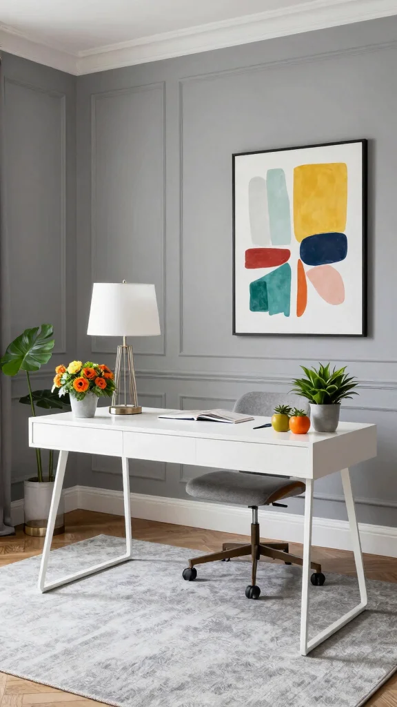
Gray is a timeless and versatile color that offers a perfect balance of calmness and energy. It serves as a sophisticated backdrop for any study space, allowing you to create a focused environment. When using gray, consider adding pops of color through decor or accessories to keep the room lively and engaging.
To design with gray effectively, opt for a light gray for walls to create a spacious feel while using darker elements to ground the room. Incorporate colorful artwork or decor to prevent the space from feeling dull and lifeless.
Explore these designing tips with gray:
– Use a light gray for walls to create a spacious feel, while darker elements can ground the room.
– Incorporate colorful artwork or decor to prevent the room from feeling drab.
– Pair with white furniture for a minimalist look.
This color scheme fosters tranquility and motivation, making it perfect for achieving your goals.
Recommended Products

You're In Luck - Our green monochromatic metallic and matte eyeshadow palette is sure to be the star of your makeup collection. Featuring 9 richly pigmented shadows in every shade of green you could ever possibly imagine, this palette has it all.
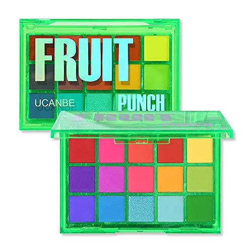
❤ This FRUIT PUNCH eye palette is inspired by colorful juice and jam, mixture of 15 highly pigmented mattes, rich metallics foils, and shimmers—all with smooth, silky rainbow powder come in a fun acrylic case,suit very skin tone and eye color.

❤. This UCANBE forest green eye palette is mixture of 15 stunning green hue shades that velvety & go on smoothly texture with matte satin finishes to create next level looks to unleash your artistry. Each blendable, buildable and long-lasting, created to suit every skin tone and eye color.
9. Vibrant Coral
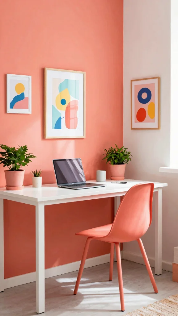
Coral is a lively and cheerful color that can brighten your study room, creating an atmosphere filled with energy. This color stimulates creativity while maintaining a warm ambiance, making it a delightful choice for your workspace. To keep coral from overwhelming the space, balance it with neutral shades that ground the overall look.
To effectively incorporate coral, consider using it as an accent color in furniture or decor. Pairing it with soft grays or whites creates a refreshing contrast that enhances the lively vibe of the room.
Here are some coral color tips:
– Use coral as an accent color in furniture or decor to keep it from dominating the space.
– Pair with soft grays or whites for a refreshing contrast.
– Incorporate playful artwork to enhance the lively vibe.
A coral-themed study room invites positivity and motivation, making it easier to engage with your tasks enthusiastically.
10. Rich Teal
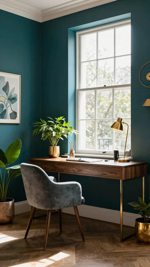
Teal is a deep and sophisticated color that beautifully balances energy and calmness. It encourages creativity while creating a soothing space for focused work. This color pairs well with lighter shades or warm wood elements to maintain a cozy yet vibrant atmosphere in your study.
To effectively use teal, consider it for an accent wall that serves as a statement while remaining inviting. Combining teal with gold decor adds a touch of elegance, making the space feel more upscale.
Check out these teal decorating ideas:
– Use teal on an accent wall for a statement that’s still warm and inviting.
– Combine with gold decor for a touch of elegance.
– Layer with soft pillows and textured throws to enhance comfort.
Choosing teal for your study room will create a dramatic yet calming environment, perfect for a creative work session.
Teal is a powerful anchor in study room color ideas—calm enough for focus, vibrant enough to spark creativity. Try an accent wall in Rich Teal and pair it with warm wood and gold accents for an inviting, productive workspace.
Rich Teal
Editor’s Choice


11. Invigorating Orange

Orange is a bold and energizing color that can enliven your study space while maintaining a warm atmosphere. This vibrant hue is known to stimulate mental activity, making it ideal for brainstorming or creative tasks. When using orange, balancing it with calm colors like whites or soft grays can prevent overstimulation and keep the environment conducive to focus.
To effectively use orange, consider incorporating it as an accent color to maintain energy without overwhelming the room. Pairing it with neutral tones enhances sophistication and keeps the ambiance inviting.
Implement these tips for using orange effectively:
– Use orange as an accent color to keep the energy without overwhelming the space.
– Pair with neutral tones for a more sophisticated look.
– Incorporate fun, quirky decor items to enhance the room’s personality.
An orange-themed study room can inspire creativity and motivate you to dive into your work with enthusiasm.
12. Tranquil Whites
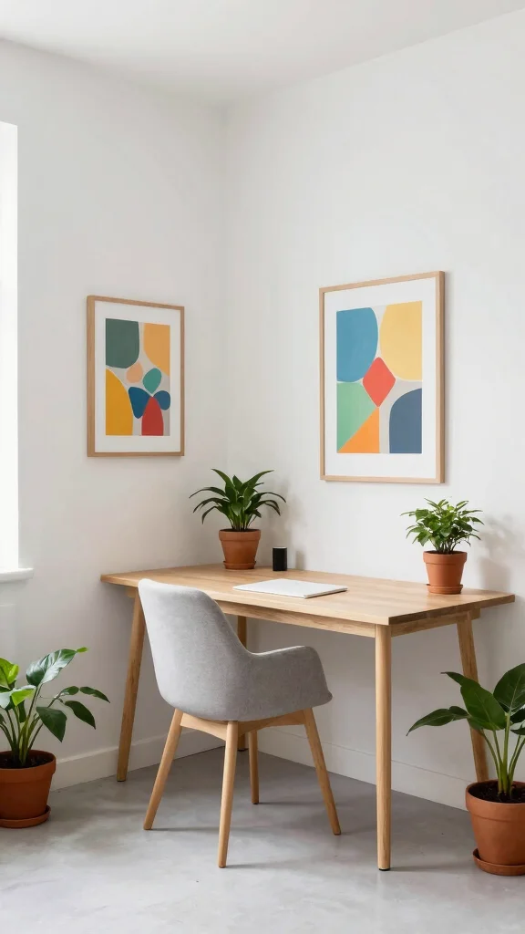
White is the ultimate choice for crafting a bright and airy study room that feels spacious and serene. This neutral base serves as a clean backdrop, allowing other elements in the room to shine. Its versatility means white can be paired with any color, making it suitable for various design styles.
To enhance a white study room, consider using textured fabrics and layered materials to add warmth and depth. Incorporating colorful accent pieces keeps the space from feeling sterile while adding character to the room.
Here are some tips for a tranquil white room:
– Use textured fabrics and layered materials to add warmth.
– Incorporate colorful accent pieces to keep the space from feeling sterile.
– Use plants to add life and color to the room.
A study room dominated by whites creates a calming atmosphere, allowing you to focus on your work without distractions.
Conclusion
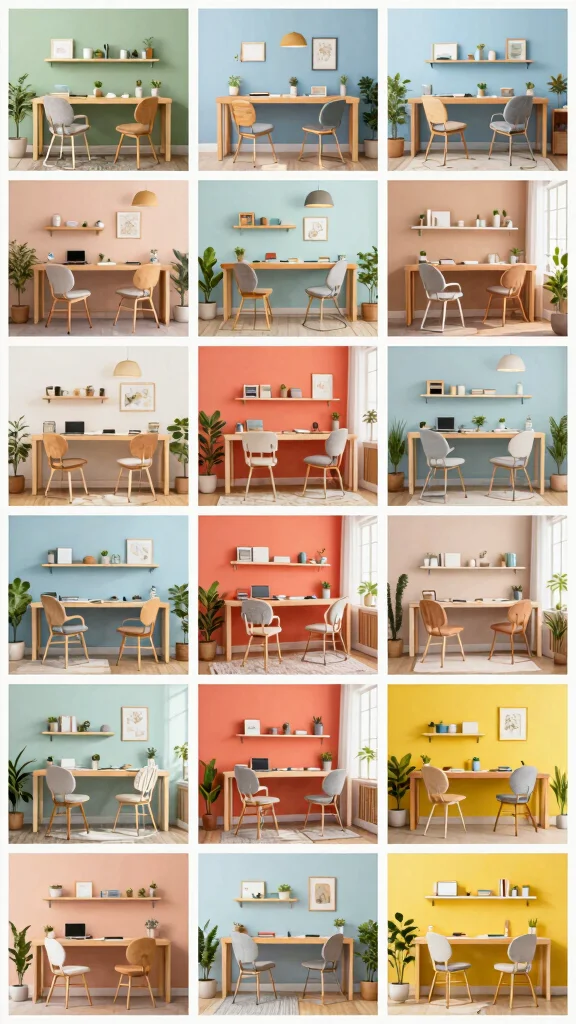
Finding the right color for your study room can significantly enhance your overall productivity and mood. Each of these twelve color ideas balances energy and calm, making your workspace not only beautiful but functional.
Experiment with these eco-friendly color schemes and see which combination resonates with you the most. A little change in color can lead to a huge difference in your study experience!
Note: We aim to provide accurate product links, but some may occasionally expire or become unavailable. If this happens, please search directly on Amazon for the product or a suitable alternative.
This post contains Amazon affiliate links, meaning we may earn a small commission if you purchase through our links, at no extra cost to you.
Frequently Asked Questions
What are the best calming paint colors for a study that are also eco-friendly?
For eco-friendly calming paint colors in a study space, choose low-VOC or zero-VOC paints from trusted brands. Great options include soft blues, sage greens, and warm neutrals as part of your calming paint colors for study palette.
Look for eco-friendly features like recycled packaging and durable finishes, and avoid strong odors. Test swatches on different walls and lighting, then pair with natural wood and plants to reinforce your study room color ideas.
How can I balance energy and calm using study room color schemes?
A practical approach is a dominant calm color with purposeful energetic accents. Use a study room color schemes framework like a neutral base (cool gray or warm beige) with a pop of energetic color combinations in accessories or a single accent wall. Keep the space well-lit and add natural textures to maintain balance, all while choosing eco-friendly paints and materials for a sustainable setup.
Which color schemes help with focus in a home office while being mindful of the environment?
Focus-friendly schemes combine soothing neutrals with small, purposeful bursts of color. Think cool neutrals (greige, soft taupe) paired with a energetic accent like a sunlit yellow or seafoam green. Use eco-friendly paints and finishes, and keep the majority of surfaces in restful tones to support lasting concentration and productivity in your home office color inspiration plan.
What shades are energizing without being overwhelming for a study room?
Opt for light, uplifting shades in small doses rather than large swaths of bold color. Try a muted yellow, teal, or coral as an energetic color accent against a calm backdrop. Use these colors on furniture, accessories, or an accent wall to boost alertness without fatigue, all while sticking to study room color ideas that prioritize sustainability and low-VOC paints.
How can I implement eco-friendly study room color ideas on a budget?
Start with a solid plan: pick a main neutral from eco-friendly paints, then add budget-friendly accents in sustainable materials. Buy sample sizes to test colors before committing, repurpose or upcycle furniture, and use removable wall decals or reusable art to achieve study room color ideas without breaking the bank. This approach keeps you aligned with balancing colors for productivity while staying environmentally conscious.
Related Topics
study room color ideas
calming paint colors
energetic color combinations
home office inspiration
eco-friendly decor
balancing colors
productivity tips
color psychology
minimalist study
creative workspace
easy color schemes
trending colors