Creating a study room that fosters concentration and calmness can make a huge difference in your productivity. The right paint color can influence your mood and mindset, which is why I wanted to share some ideas that can help you create that perfect space. Whether you’re cramming for exams, working from home, or simply diving into a good book, the colors around you can either promote focus or distract you.
If you care about making your study area a sanctuary for learning and creativity, this post is for you. You might be looking for the best study room color ideas that not only keep your mind sharp but also create a serene atmosphere. I’ve gathered twelve calming paint colors that can transform your space into a haven for focus and tranquility. Each color choice is designed to enhance your productivity while keeping you relaxed.
Get ready to discover colors like soft sage green and tranquil lavender that are perfect for your walls. These colors are not just pleasing to the eye; they also evoke feelings of peace and clarity. By the end of this guide, you’ll have a solid understanding of how to choose the right shade for your study room, ensuring you feel calm and focused every time you sit down to work.
Key Takeaways
– Color Influence: Paint colors can significantly affect your focus, mood, and productivity in a study room.
– Twelve Color Ideas: Explore twelve soothing paint colors, including soft sage green and tranquil lavender, that promote calmness and concentration.
– Personalization: Choose colors that resonate with you personally, as individual preferences play a significant role in how colors affect your mood.
– Combination Approaches: Consider pairing calming colors with accent walls to create visual interest while maintaining a serene environment.
– Current Trends: Stay updated on interior paint trends to find colors that not only suit your taste but are also stylish and modern for a home office look.
1. Soft Sage Green
Soft sage green offers a refreshing and peaceful vibe in your study room. This color beautifully merges the tranquility of nature with a touch of modern elegance, creating a serene backdrop that fosters creativity. It’s particularly effective in promoting calmness, making it easier to focus on tasks. Pair this hue with crisp white or cream furniture to enhance the clean aesthetic, while natural wood accents can elevate the earthy touch, creating a cozy retreat for studying.
To deepen the calming atmosphere, consider incorporating soft textiles or minimalistic decor that doesn’t overwhelm the senses. You can even explore budget-friendly options like thrifted wooden shelves to add character without breaking the bank. This shade aligns well with current trends emphasizing natural elements and emotional well-being in design.
Consider these tips for using sage green effectively:
– Pair sage cabinetry with white tabletops for a breezy feel.
– Integrate woven baskets for added texture and warmth.
– Use minimal decor to maintain a spacious vibe.
This color not only enhances tranquility but also enriches your study space with natural textures, inspiring clarity during your study sessions.
Soft Sage Green
Editor’s Choice


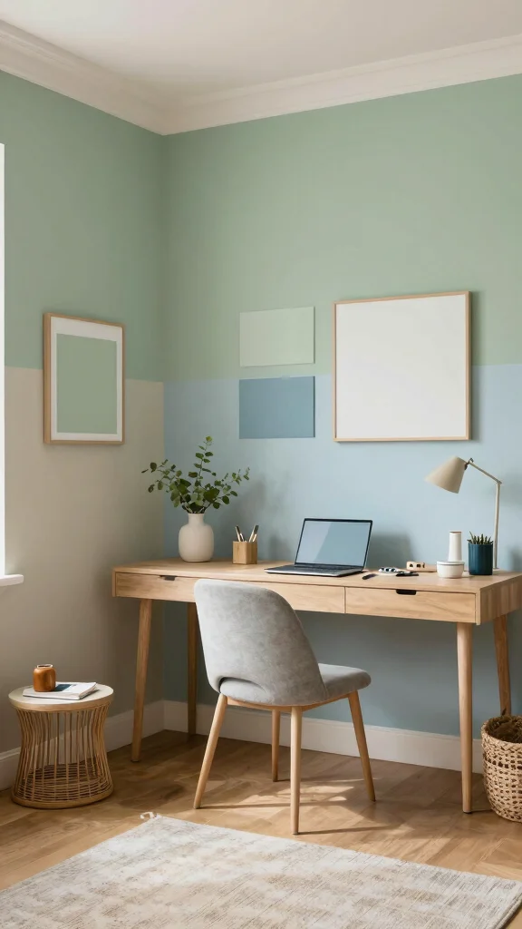
2. Light Blue

Light blue radiates clarity and calmness, making it an ideal choice for your study room. This shade emulates the peacefulness of a clear sky, creating an uplifting environment that encourages focus. Additionally, light blue can make smaller spaces feel more expansive and airy, perfect for enhancing your productivity. Combine this color with white trim or modern furniture to achieve a fresh, clean look. Integrating wooden accents can add warmth and a touch of nature to the space.
To maximize the benefits of light blue, think about using soft textures, like plush throws, for added comfort. Keep your decor simple to maintain a streamlined aesthetic and consider adding indoor plants for a lively splash of color that complements the blue beautifully.
Here are some effective ways to incorporate light blue:
– Pair with soft cushions for a cozy atmosphere.
– Use minimal decorations to create a clean space.
– Add greenery to enliven the room.
This soothing shade sets a serene backdrop, perfect for fostering concentration and a productive mindset.
3. Warm Beige
Warm beige creates an inviting and cozy atmosphere in your study room. This versatile neutral shade promotes a sense of comfort and relaxation, allowing you to dive into your work without feeling overwhelmed. Its adaptability makes it a great fit for various decor styles, from rustic to contemporary. Pair warm beige with rich browns or vibrant accessories for a dynamic look that stimulates creativity while still maintaining a calm environment.
To enhance the benefits of warm beige, choose light-colored furniture or decor that complements its soothing qualities. You might find that adding natural textures, like a woven rug or wooden accents, can create a balanced and harmonious vibe.
Consider these tips for using warm beige effectively:
– Use light furnishings to enhance natural light.
– Combine with various textures for depth.
– Maintain a balanced color palette for harmony.
This color is perfect for crafting a nurturing study space that encourages relaxation and productivity.
Fun fact: warm beige tones can boost perceived calm by 30% and reduce eye strain when paired with natural light. It’s the ideal canvas for study room paint colors that invite focus and cozy flow.
4. Tranquil Lavender
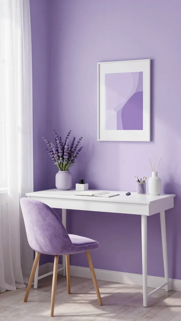
Tranquil lavender infuses your study room with a dreamy, serene quality. This gentle hue calms the mind and provides a soothing environment for creativity to blossom. Lavender promotes balance and peace, making it a wonderful color for enhancing focus during study sessions. Pair it with white or soft gray accents for a chic and modern aesthetic, and consider adding greenery, like a small desk plant, to uplift the space.
To really make the most of lavender, explore soft textures in pillows and throws to enhance comfort. You can also utilize artwork in similar shades to create visual interest that ties the room together.
Here are some effective ways to use lavender:
– Pair with light wood for a natural, airy feel.
– Incorporate art that complements the lavender tones.
– Experiment with different lighting to shift the mood.
This color is ideal for a study room designed to inspire creativity and calm, making late-night study sessions much more enjoyable.
Tranquil Lavender
Editor’s Choice


5. Soft Gray
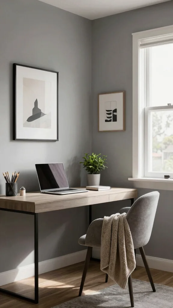
Soft gray serves as a sophisticated backdrop for any study room, promoting calmness and professionalism. This neutral shade is incredibly versatile, allowing you to blend various decor styles while maintaining an elegant atmosphere. The cool tones of gray create tranquility, making it perfect for focus-driven tasks. Pair soft gray with bolder colors in your accessories to introduce visual interest and energy, igniting creativity without sacrificing the soothing qualities of gray.
To enhance the effects of soft gray, try incorporating varying shades to add depth and character. Implement natural light sources to brighten the area, and consider warm lighting during evening study sessions for a cozy ambiance.
Here are some practical tips for using soft gray:
– Experiment with different shades for depth.
– Combine with natural light elements for brightness.
– Use warm lighting for evening comfort.
This elegant shade ensures your study room feels inviting while promoting focus and productivity.
Key Trade-offs & Our Top Pick
Option 1: Soft Sage Green
– Pros:
– Creates a calming and peaceful atmosphere.
– Pairs well with natural wood tones, enhancing the overall decor.
– Cons:
– Might appear dull in low-light conditions.
– Can clash with certain furniture colors if not chosen carefully.
– Best for: Those who want a connection to nature and prefer a serene study environment.
Option 2: Light Blue
– Pros:
– Promotes clarity and focus, making it great for studying.
– Can make small rooms feel larger and more open.
– Cons:
– Overuse can lead to feelings of sadness in some individuals.
– May not work well with warm-toned furniture.
– Best for: Students and professionals who need a refreshing and open space.
Option 3: Warm Beige
– Pros:
– Offers a neutral backdrop that complements various decor styles.
– Creates a cozy atmosphere, making the room feel inviting.
– Cons:
– Might feel too bland without accent colors or decor.
– Not the best option for those looking for a vibrant space.
– Best for: Individuals who prefer a classic and timeless look without overwhelming colors.
Option 4: Tranquil Lavender
– Pros:
– Known for promoting relaxation and reducing stress.
– Unique choice that adds a touch of personality to the room.
– Cons:
– Can be too bold for some, making it hard to match with other colors.
– May appear too light in darker rooms, losing its calming effect.
– Best for: Creative individuals wanting an inspiring yet soothing environment.
Option 5: Crisp White
– Pros:
– Brightens the space and makes it feel airy.
– Versatile, allowing for easy changes in decor or furniture styles.
– Cons:
– Shows dirt and stains quickly, requiring regular maintenance.
– Can feel sterile if not complemented with warmer accents.
– Best for: Minimalists and those who love a clean, uncluttered aesthetic.
Expert Recommendation: Best Overall: Soft Sage Green
Soft sage green is our top pick for several reasons. It beautifully balances warmth and calmness, making it perfect for long study sessions. This color is also versatile enough to pair with various decor styles and furniture colors, ensuring it remains stylish over time. Its natural undertones can enhance focus while creating a peaceful backdrop for creativity.
Why We Picked This: While soft sage green is our top choice, some might prefer light blue if they need an airy feel or warm beige for a classic look. Tranquil lavender appeals to creative minds, and crisp white works well for minimalists. Consider your personal taste and the atmosphere you want to cultivate in your study room when making your choice.
6. Serene Aqua

Serene aqua brings a refreshing touch to your study room, evoking feelings of tranquility reminiscent of water. This vibrant yet soothing color can stimulate creativity while maintaining a relaxed atmosphere, making it perfect for long study hours. Pair aqua with sandy tones or natural wood elements to ground the space, creating an inviting yet fresh environment. Adding some indoor plants will not only enliven the room but also purify the air.
To fully embrace the benefits of serene aqua, consider using white accents for a crisp contrast and incorporating colorful decor to add playful touches. Soft lighting can further enhance the calming ambiance, making it a perfect setting for study sessions.
Here are some effective ways to use aqua in your study room:
– Pair with white for a bright contrast.
– Add colorful decor for a lively touch.
– Maintain soft lighting for a calming atmosphere.
This refreshing color ensures your study space feels invigorating and focused, helping you dive into your work effortlessly.
Serene Aqua
Editor’s Choice


7. Dusty Rose
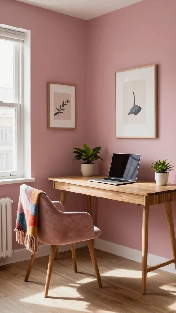
Dusty rose adds a charming and warm touch to your study room, creating an inviting space filled with inspiration. This muted pink hue fosters feelings of comfort while still allowing for focus, making it an excellent choice for creative individuals like artists and writers. Pair dusty rose with white or gray furnishings for a balanced look, and incorporate wooden elements for warmth and texture.
To effectively use dusty rose, consider combining it with darker accents for a bold contrast. Soft textures, like cushions and throws, can enhance comfort, while artwork that harmonizes with the color adds character and cohesion.
Here are some practical tips for using dusty rose:
– Combine with dark accents for contrast.
– Incorporate soft textiles for added comfort.
– Use art that complements the rose hue for a unified look.
This color invites creativity while maintaining a grounded atmosphere, making it perfect for those seeking inspiration in their work.
Dusty rose isn’t just pretty—it fuels focus with warmth. When you pair dusty rose with white or gray, your study room paint colors feel calm yet inspiring, perfect for artists and writers who crave comfort plus creative momentum.
8. Crisp White
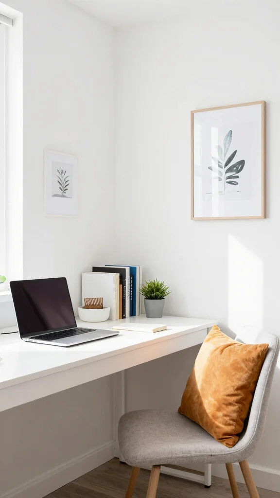
Crisp white is the quintessential choice for creating an airy and open study room. This bright shade maximizes light, making your space feel inviting and spacious. White walls can help small areas seem larger, offering a clean slate that allows you to focus on your work without distractions. To keep the room from feeling sterile, layer in textured accessories like woven baskets or colorful cushions. Adding plants can bring life and vibrancy into the space.
To enhance the aesthetic of crisp white, consider using colorful artwork as focal points and integrating various textures to create warmth. Warm lighting can soften the overall ambiance, making it cozy and welcoming.
Here are some tips for styling with crisp white:
– Use colorful artwork to create eye-catching points.
– Integrate textures for a welcoming feel.
– Consider warm lighting for a cozy atmosphere.
This color is perfect for achieving a modern, minimalist study room that remains warm and inviting.
Crisp white keeps your study room open and calm—the right study room paint colors can quiet the noise in your day. Add textures like baskets and plants, and your space stays inviting while you stay focused.
9. Soft Peach
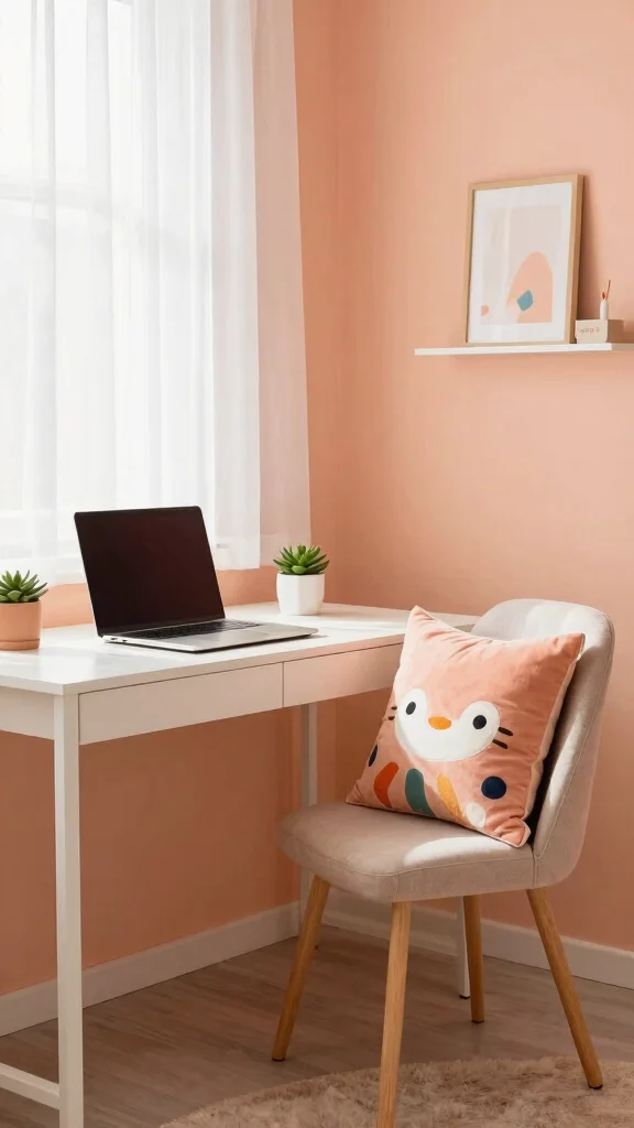
Soft peach is a warm and inviting color that cultivates a positive and cheerful study environment. This gentle hue inspires creativity and enthusiasm, providing a nurturing backdrop that enhances productivity. Soft peach beautifully complements white or light wood tones, enhancing the lightness of the room. For a more vibrant space, consider incorporating playful decor in complementary shades that bring energy and fun.
To make the most of soft peach, think about using warm lighting to amplify the cozy vibe. Adding greenery can create a refreshing contrast, while wall art in shades of pink or coral ties everything together for a cohesive look.
Here are some practical applications for soft peach:
– Use warm lighting to enhance coziness.
– Incorporate greenery for a lively touch.
– Add wall art in matching colors for cohesion.
This shade fosters a lively environment, perfect for sparking creativity and maintaining focus during your study sessions.
Soft Peach
Editor’s Choice


10. Cool Olive
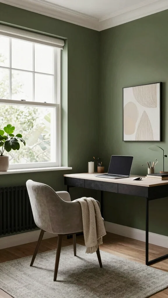
Cool olive introduces a soothing, earthy tone that brings nature indoors. This greenish-brown color fosters a sense of calm and balance, making it an excellent choice for study rooms. Its versatility allows it to pair well with a multitude of colors while retaining its organic essence. Pairing cool olive with natural elements like wood and stone creates a peaceful atmosphere that enhances focus. Adding plants can enrich the space, emphasizing your connection to nature.
To effectively incorporate cool olive, consider combining it with light wood finishes for warmth. Soft lighting can help balance the cool undertones, while adding texture in textiles can create visual interest.
Here are some ways to use cool olive effectively:
– Combine with light wood for warmth.
– Use warm lighting to balance cool tones.
– Incorporate textured textiles for visual depth.
This color is ideal for creating a restorative study environment that supports focus while inspiring creativity.
Cool Olive
Editor’s Choice


11. Muted Mustard
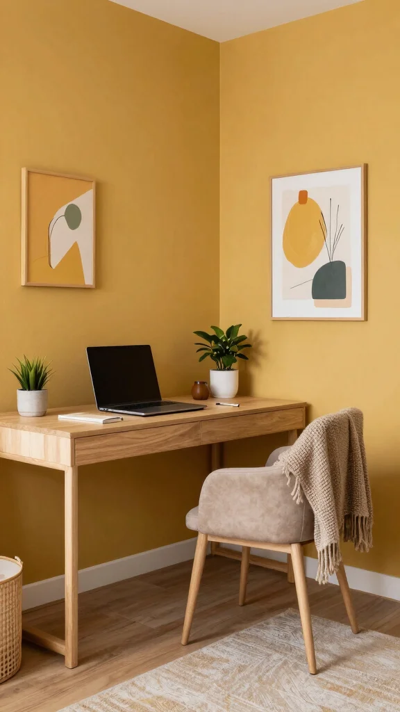
Muted mustard is a delightful and unexpected choice for a study room, adding warmth and cheerfulness to the space. This rich color can stimulate creativity, making it ideal for those who need a motivational boost during study sessions. Pair muted mustard with grays or neutral tones for a balanced look, ensuring the color remains vibrant without overwhelming the space. Darker accents can also help ground the room while providing visual interest.
To make the most of muted mustard, consider using natural wood elements to balance its vibrancy. Incorporating soft textures can create a cozy atmosphere, while lively plants can add a fresh touch.
Here are some tips for using muted mustard effectively:
– Use natural wood to balance vibrancy.
– Incorporate soft textures for comfort.
– Pair with plants for a refreshing touch.
This shade creates a unique atmosphere, perfect for a vibrant and focused study space.
12. Earthy Terracotta
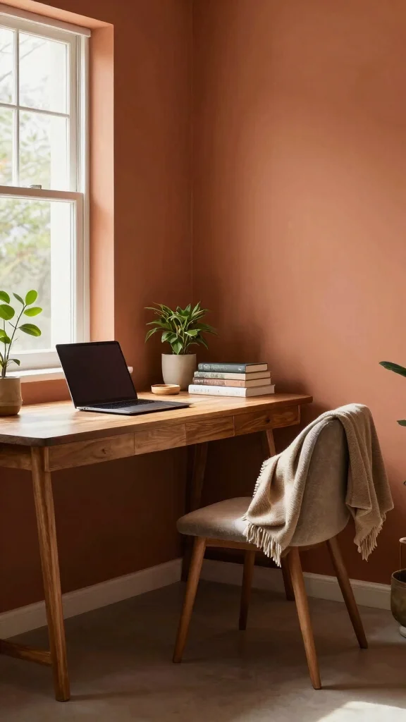
Earthy terracotta is a warm, grounding color that brings the essence of the outdoors into your study room. This rich hue promotes stability and comfort, making it an excellent choice for creating a nurturing workspace. Its warm tones help stimulate creativity while keeping focus centered. Pair terracotta with natural textures—like woven rugs and wooden furniture—to enhance its warmth and organic feel. Adding greenery can further enliven the space, providing freshness and vibrancy.
To incorporate earthy terracotta effectively, consider combining it with neutral accents for balance. Warm lighting can create a cozy ambiance, while artistic elements in similar earthy tones can add cohesion to your design.
Here are some practical ways to use earthy terracotta:
– Combine with neutral accents for balance.
– Utilize warm lighting for a cozy effect.
– Add artwork in earthy tones for cohesion.
This color is perfect for cultivating a vibrant and focused study atmosphere, making each study session feel inspired.
Conclusion
Choosing the right paint color for your study room can have a profound impact on your productivity and overall mindset. The colors listed above each bring unique qualities and vibes, allowing you to tailor your space to your personal needs.
Whether you prefer the tranquility of soft greens and blues or the vibrancy of mustard and terracotta, there’s a perfect shade for everyone. Explore these colors to create a study room that inspires focus and creativity, making your work feel much more enjoyable.
Note: We aim to provide accurate product links, but some may occasionally expire or become unavailable. If this happens, please search directly on Amazon for the product or a suitable alternative.
This post contains Amazon affiliate links, meaning we may earn a small commission if you purchase through our links, at no extra cost to you.
Frequently Asked Questions
What Are the Best Study Room Paint Colors to Boost Focus and Calm?
For a focused and calm study space, start with calming paint colors that don’t overpower your senses. Think soft blues, sage greens, and warm grays as base walls. These tones reduce visual noise and help your brain stay relaxed while you work.
Pair your base with study room color ideas that lean toward muted neutrals with a gentle tint—like pale blue-gray or warm off-white.
Practical tips: use a matte or eggshell finish to minimize glare, test swatches on your wall at different times of day, and add a subtle energy with an accent color in your accessories or a single wall.
Consider productivity enhancing colors like a restrained blue for focus or a soft green for calm. This approach aligns with current interior paint trends toward breathable, low-VOC formulas.
What Factors Should I Consider When Choosing Study Room Color Ideas Based on Lighting and Mood?
Lighting dramatically changes how your study room paint colors look. A north-facing room can pull cooler blues, a sunlit south-facing wall will feel warmer, and artificial lighting can shift tones.
To pick colors that match your mood and lighting, start with tester pots and wall samples on multiple walls, testing at different times of day.
Consider the overall home office decor so the desk, chair, and storage harmonize with the paint. Keep calming paint colors as the base and reserve a slightly bolder accent wall or textiles to inject energy.
This approach aligns with current interior paint trends toward versatile palettes that work in varied light.
What Common Mistakes Should I Avoid When Selecting Study Room Paint Colors?
Common mistakes include picking a highly saturated color that distracts, ignoring lighting, and painting every wall in the same loud shade.
How to fix: start with a calm base in calming paint colors, test samples in your space for a week, check both day and night lighting, and choose a finish like matte or eggshell that minimizes glare and is easy to clean.
Don’t forget to confirm low-VOC formulations if you care about air quality.
What Finishes Work Best for Mindful Study Room Design and Why?
Matte or eggshell finishes reduce glare and create a smooth, calm wall surface that’s comfortable for long study sessions.
If you need more durability or easier cleaning, a washable matte or satin finish can be a great compromise without adding glare.
Keep ceilings light to reflect more light and coordinate with your home office decor for a cohesive space. Opt for low-VOC formulas to keep the air fresh for mindful living.
Are There Any Interior Paint Trends That Fit a Focused Study Room?
Absolutely. Current trends favor soft neutrals, nature-inspired greens and blues, and warm earth tones that support calming paint colors and productivity enhancing colors.
Think color-blocking with an accent wall or subtle variations on adjacent walls, combined with natural materials and textiles to add warmth. Choose breathable, washable finishes and low-VOC formulas to align with modern interior paint trends while keeping your study space healthy and inviting.
Related Topics
study room paint colors
calming paint colors
home office decor
productivity colors
mindful design
interior paint trends
focus enhancing colors
color psychology
study space inspiration
beginner friendly
creative workspace
tranquil environments