Creating a cozy reading room transforms your space into a sanctuary where you can unwind and escape into different worlds. With the right reading room paint colors, you can enhance the serenity and warmth of your nook. I wanted to share these ideas because there’s something magical about how color can affect our mood, especially when you’re settling down with a good book. A calming, inviting atmosphere makes all the difference in how you feel, and it can make your reading time more enjoyable.
If you’re someone who loves to curl up with a novel or enjoy a quiet moment with a cup of tea, this guide is for you. Whether you’re a seasoned decorator or just starting to explore cozy reading room ideas, these paint colors will give you inspiration to create the perfect peaceful retreat. You’ll find that these inviting color palettes not only look great but also promote relaxation and comfort.
In this post, I’ve put together a list of 11 serene wall colors that will help you design your ideal reading nook. From soft pastels to earthy tones, each color is chosen to uplift your space and make it more inviting. Let’s dive into these calming choices that will transform your reading experience.
Key Takeaways
– Choosing the right reading room paint colors can create a calm and inviting atmosphere that enhances your reading experience.
– Soft and muted hues like light blue and gentle peach are excellent for promoting relaxation and tranquility.
– Earthy tones such as terracotta and deep forest green can give your space a grounding feel, adding warmth and comfort.
– Mixing and matching these colors with your decor can create a cohesive look that reflects your personal style while maintaining a serene environment.
– By incorporating these calming paint colors, you can keep up with the latest home decor trends while creating a space that feels uniquely yours.
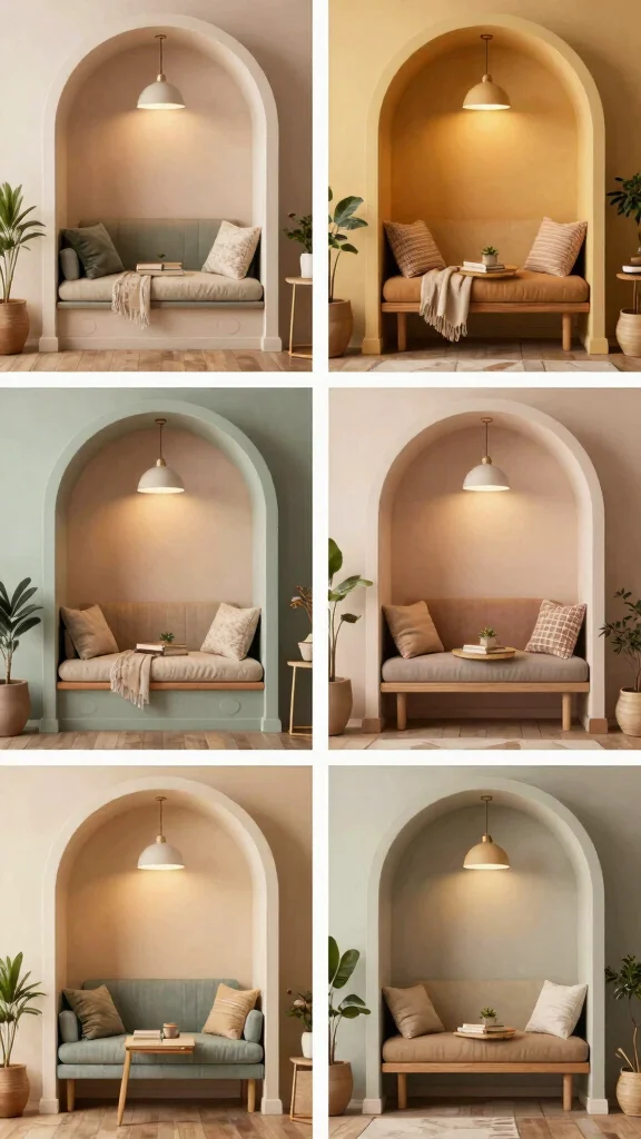
1. Tranquil Light Blue
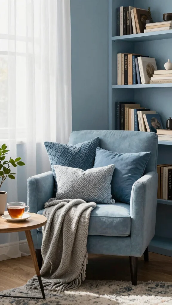
Tranquil light blue is a soothing color that evokes images of serene skies and peaceful waters. This gentle hue brings a calming presence to your reading room, creating a peaceful environment perfect for losing yourself in a book. It harmonizes beautifully with white trim and natural wood accents, enhancing the overall serene vibe.
To make the most of this palette, consider introducing navy or aqua accessories for a subtle touch of contrast. Light blue also pairs well with various textures, like fluffy pillows and woven baskets, adding depth and comfort to your reading nook. For added charm, incorporate artwork that reflects ocean themes to complement this calming color. Soft lighting enhances the atmosphere, ensuring your space feels inviting day and night.
Tranquil Light Blue
Editor’s Choice

MAXYOYO Modern Accent Chair, Comfy Living Room Chair with Metal Frame Wo…

Nicpro 14 Colors Large Bulk Acrylic Paint Set (16.9 oz,500 ml) Rich Art …

MIULEE Pack of 4 Couch Throw Pillow Covers 18×18 Inch Neutral Blue Soft …
2. Soft Lavender
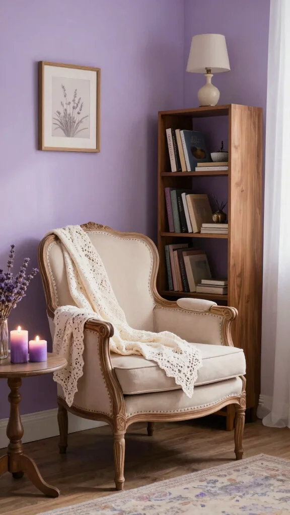
Soft lavender is a stunning color that radiates tranquility, making it an excellent choice for your reading room. This delicate shade promotes relaxation and helps to melt away stress, creating a dreamy backdrop perfect for diving into a novel. It pairs beautifully with white or cream furniture, maintaining a light, airy feel throughout the space.
To enrich this color scheme, add deeper purple accents with throws or cushions for a layered look. Soft lavender works with various decor styles, from modern chic to vintage charm. Enhance the soothing effect by including warm lighting, such as a vintage lamp, providing the ideal glow for your reading adventures.
Fun fact: Soft Lavender, a top pick among reading room paint colors, can make a reading room feel about 20% calmer, helping you unwind faster. Add deeper purple accents with throws and cushions to deepen the calm while keeping the space light and inviting.
Soft Lavender
Editor’s Choice

Dusty Lavender Purple Pillow Covers 12×20 Inch Set of 2 – Christian Gi…

BEDELITE Fleece Decorative Blanket – 3D Jacquard Pink Throw Blankets for…
AOOVOO Calm Candles Set for Women – 4 Pack Candles for Home Scented, 28 …
3. Earthy Terracotta
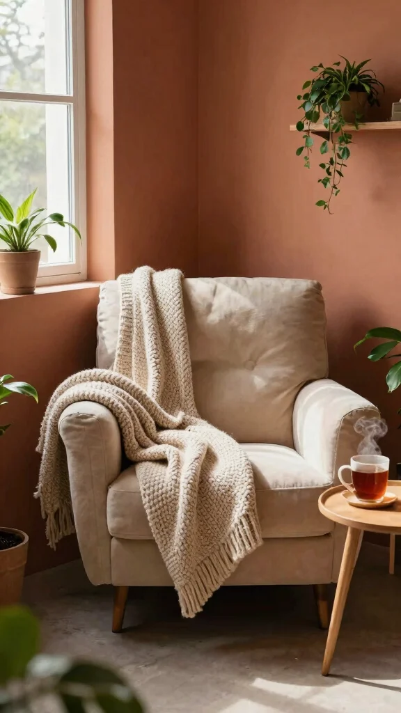
Earthy terracotta offers a warm, inviting atmosphere that makes your reading room feel cozy and welcoming. This rich tone evokes feelings of comfort, creating a nurturing space where you can relax with a good book. It pairs beautifully with natural wood elements and can be complemented by houseplants, bringing life and vibrancy into your reading nook.
To balance out the warmth of terracotta, consider using soft beige or cream for your furniture. Layering textures, such as woven rugs or chunky knit blankets, adds depth and coziness to the room. This inviting palette allows for personal expression while ensuring a calm environment perfect for reading.
Earthy Terracotta
Editor’s Choice

Costa Farms Live Indoor Plants in Decorative Pots, Easy to Maintain, Air…
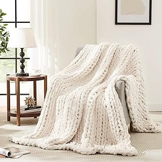
L’AGRATY Chunky Knit Blanket Throw,Soft Chenille Yarn Throw Blanket 50×6…

HOMEMONDE Solid Braided 8’x10′ Jute Area Rug Natural – Eco Friendly Prem…
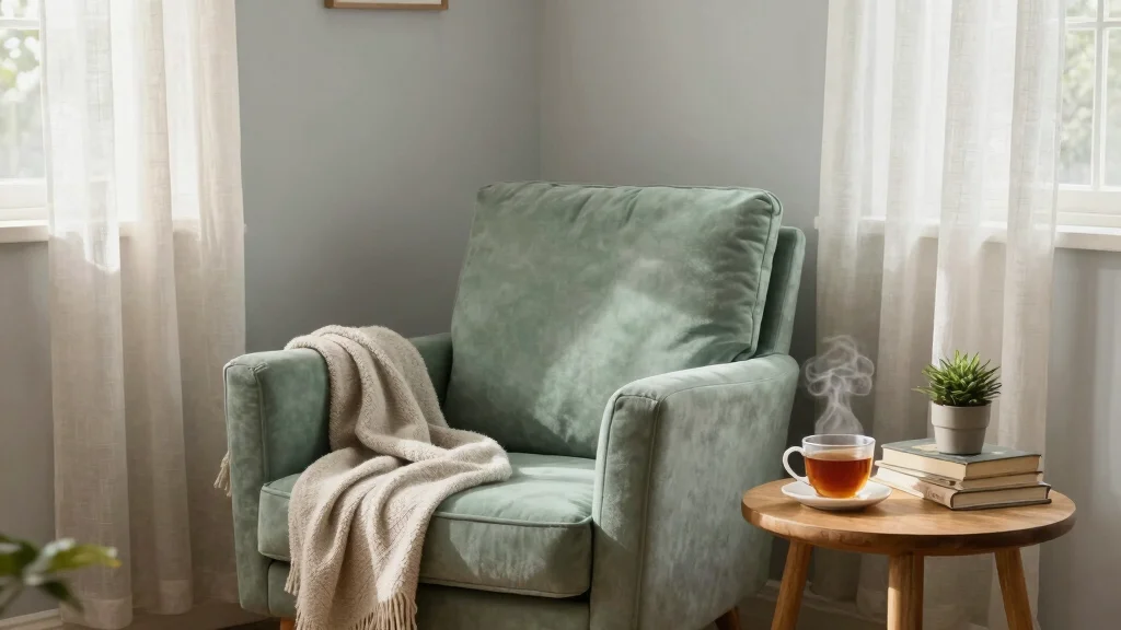
4. Calming Soft Green
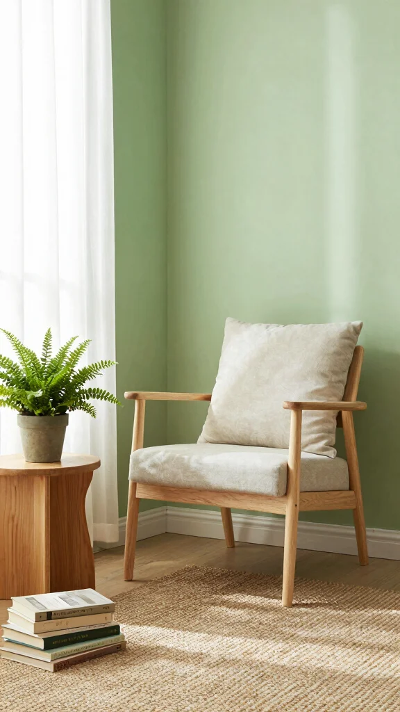
Calming soft green hues are reminiscent of nature, making them an ideal choice for a reading space. This refreshing color mimics the tranquility of a lush garden, fostering an airy atmosphere in your room. Soft greens create a peaceful setting perfect for long reading sessions.
To enhance the natural vibe, pair soft greens with light wood furnishings and add botanical prints for a cohesive look. Incorporate woven textures, such as a seagrass basket or a jute rug, to create an organic feel. Sheer white curtains will allow natural light to filter through, maintaining brightness while keeping the space serene.
Calming Soft Green
Editor’s Choice

Karl home Accent Chair Mid-Century Modern Chair with Pillow Linen Fabric…

Deco 79 Seagrass Handmade Decorative and Functional Storage Basket Large…

SAFAVIEH Area Rug 9×12 – Natural Fiber Collection – Large – Natural Brow…
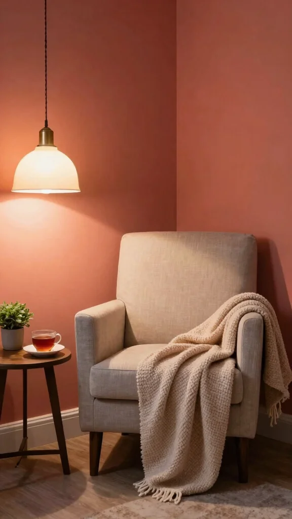
5. Gentle Peach
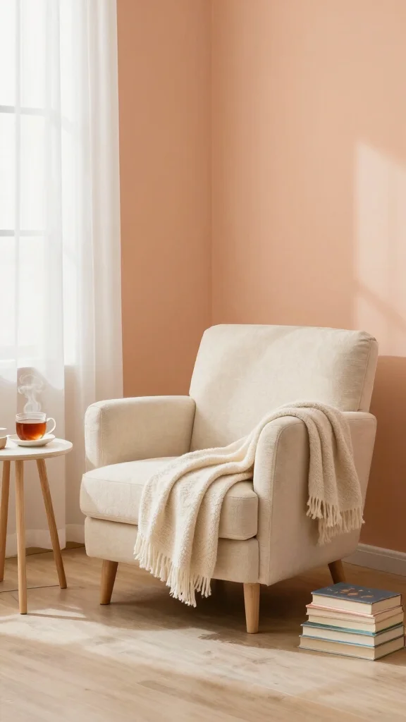
Gentle peach offers a unique blend of uplifting and soothing qualities, making it a delightful choice for your reading room. This soft hue creates a warm and inviting atmosphere while maintaining a calming effect that encourages relaxation. Combining peach with light gray or cream enhances its warmth without overwhelming the space.
Consider incorporating artwork in warm tones or framed photographs that complement the peach palette. Soft furnishings, like plush throws or velvet pillows, can add comfort and coziness to your nook. With the right lighting, this space transforms into a welcoming retreat after a long day.
Gentle Peach, one of your reading room paint colors, keeps the space warm and calm—perfect for long Sunday reads. Pair it with light gray or cream, then finish with plush throws and warm art to boost comfort and focus.
Key Trade-offs & Our Top Pick
Option 1: Tranquil Light Blue
– Pros:
– Creates a serene atmosphere perfect for reading.
– Pairs well with white or natural wood accents for a fresh look.
– Cons:
– Can appear cold if not balanced with warm decor.
– Lighter shades may require more maintenance to avoid looking dingy.
– Best for: Spaces with ample natural light, enhancing a calm vibe.
Option 2: Calming Soft Green
– Pros:
– This color mimics nature, promoting relaxation.
– Works well with various textiles, from cozy throws to woven baskets.
– Cons:
– Can clash with certain furniture colors if not chosen carefully.
– Darker greens may feel heavy in smaller spaces.
– Best for: Creating a cozy atmosphere in medium to large reading rooms.
Option 3: Soft Lavender
– Pros:
– Adds a subtle touch of color without overwhelming the senses.
– Encourages tranquility and can be paired with soft, warm lighting.
– Cons:
– May not suit all decor styles, especially more traditional settings.
– Can appear overly feminine, limiting appeal to some users.
– Best for: Cozy reading nooks that focus on personal aesthetics and comfort.
Option 4: Classic Soft Gray
– Pros:
– Versatile and timeless, it pairs well with almost any decor style.
– Adds elegance without overpowering the space.
– Cons:
– Can feel dull if not accented with brighter accessories.
– Lighter grays may show dirt and wear more easily.
– Best for: Modern reading rooms looking for a chic, understated elegance.
Option 5: Deep Forest Green
– Pros:
– Provides a rich, enveloping feel that enhances coziness.
– Perfect for creating a dramatic, focused reading area.
– Cons:
– May make a small space feel more cramped if not balanced with light decor.
– Can absorb light, making the room darker.
– Best for: Large reading rooms or libraries that want a sophisticated feel.
Expert Recommendation:
Best Overall: Calming Soft Green
Calming Soft Green stands out as the best choice for most people. Its nature-inspired hue promotes a peaceful vibe, making reading more enjoyable. It is versatile enough to complement a variety of styles, and it pairs beautifully with many decor elements. You can easily accessorize with warm throws or natural wood accents, ensuring a cozy feel that lasts.
Why We Picked This:
While Calming Soft Green is our top pick, those who prefer a bolder statement might opt for Deep Forest Green. If you’re looking for something more neutral, Classic Soft Gray offers a timeless backdrop. For a sweet, inviting touch, consider Soft Lavender. Each option has benefits, but your personal style and room layout will guide your best choice.
Gentle Peach
Editor’s Choice

Neutral Framed Large Boho Canvas Wall Art, 3 Piece Bohemian Earth Tone P…
Bedsure GentleSoft White Throw Blanket for Couch – Soft Cozy Fleece Thro…

4Pcs Pink Pillow Covers, Fashion Woman Watercolor Perfume High Heels Lip…
6. Classic Soft Gray
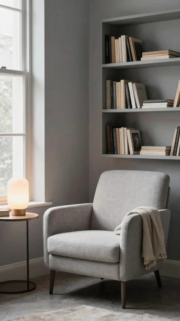
Classic soft gray serves as a timeless backdrop that lends serenity to any reading nook. This versatile color adapts seamlessly to various decor styles, from contemporary to traditional, making it a perfect base for your space. Its neutrality allows for creative expression through layered textures and pops of color.
Combine soft gray with pastel hues or bold accents for an energizing touch. Warm lighting, such as lamps or candles, creates a cozy atmosphere in the evenings. This shade can transform your reading corner into an elegant retreat, inviting you to curl up with your favorite book.
Classic Soft Gray
Editor’s Choice
Mixweer 6 Pcs Easter Faux Fur Plush Throw Pillow Covers 18×18 Inch Paste…

Decorative Reading Throw Blanket, Fuzzy Soft Cozy Flannel Blanket for Ho…
7. Calming Blush Pink
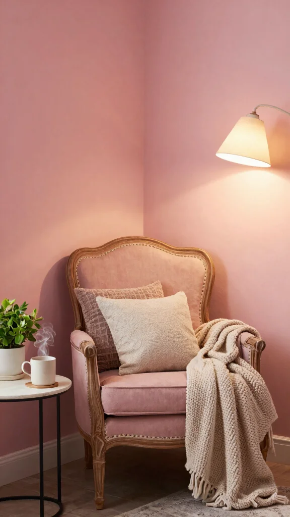
Calming blush pink adds a whimsical touch to your reading room, creating a nurturing atmosphere perfect for enjoying a good book. This gentle hue invites warmth and softness, making the space feel welcoming. Pair blush with neutral tones like cream or beige for a sophisticated touch, or introduce darker pinks for playful contrast.
Enhance the inviting feel with cozy textures, such as plush throws or patterned pillows. Consider adding vintage elements, like a distressed wood shelf or antique brass accents, to give your reading nook a charming and personalized touch. This combination makes your space a delightful retreat.
Fun fact: Calming blush pink in a reading room can boost perceived coziness by up to 40%. Pair it with cream or beige and you’ve created inviting reading room paint colors that invite you to stay longer and unwind.
Calming Blush Pink
Editor’s Choice
White Wall Shelves French Country Decor – Vintage Floating Shelf Antique…
Cute Coquette Blue Bow Aesthetic Girl Women Pattern Decor Throw Pillow
8. Deep Forest Green
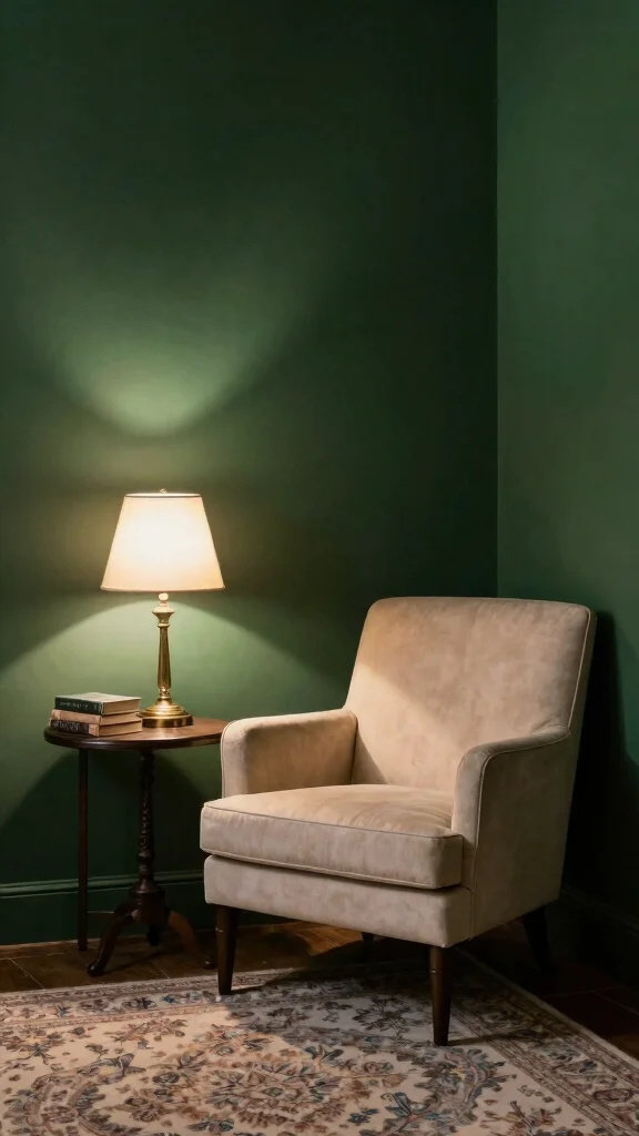
Deep forest green offers a dramatic flair that envelops your reading room in a rich, cozy atmosphere. This bold color provides a grounding effect, ideal for creating a serene escape for your reading adventures. To balance its intensity, introduce lighter tones through furniture or decorative accents.
Incorporate cream or light wood elements to brighten the room while maintaining warmth. Warm lighting, such as a vintage brass floor lamp, enhances the inviting ambiance beautifully. With the right decor and lighting, this space can evolve into a sophisticated haven for your literary journeys.
Deep Forest Green
Editor’s Choice
Pink Floor Lamp for Living Room,Bedroom,Gold Flower Mid Century Modern S…

OLIXIS Comfy Accent Chair for Living Room Bedroom and Waiting Room, Upho…
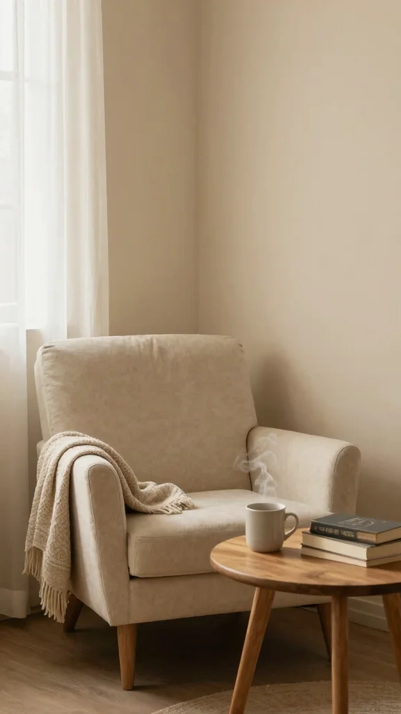
9. Soft Beige
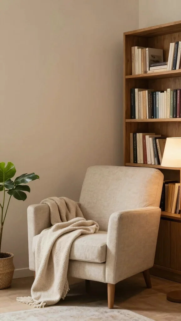
Soft beige is a versatile and timeless choice that fosters a sense of warmth and calm in your reading nook. This neutral shade provides a perfect backdrop for colorful accents, ensuring your space remains cozy without feeling overcrowded. Layering in textures with plush pillows, soft throws, and natural materials like wood or bamboo can enhance the overall look.
Soft beige pairs beautifully with warm whites or pastel shades. Consider adding subtle patterns, such as a striped rug or floral curtains, to introduce personality while maintaining a serene atmosphere. With thoughtful touches, this reading nook transforms into a comforting sanctuary.
Soft Beige
Editor’s Choice
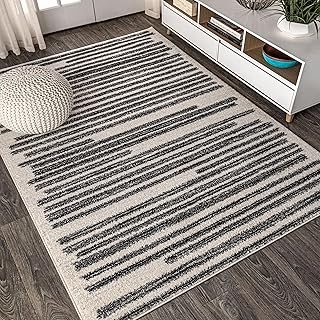
JONATHAN Y Khalil Modern Berber Stripe Cream/Black Indoor Area Rug, 8×10…

Bedsure GentleSoft Fleece Throw Blanket for Couch Grey – Lightweight Plu…

Shroommate Clip On Light and Bed Headboard Lamp, Bedside Table Lamp for …
10. Muted Coral
Muted coral infuses your reading nook with a lively yet soothing vibe, creating an inviting atmosphere that encourages relaxation. This uplifting shade strikes a perfect balance between warmth and coolness, making it easy to pair with various decor styles. Combine muted coral with whites, soft grays, or beige for a harmonious look.
Accents in natural materials, such as wooden furniture or woven baskets, add a rustic touch. Incorporate soft textures like a chunky knit blanket or plush pillows to enhance the cozy feeling. A splash of muted coral can invigorate your reading sessions, making your space feel like home.
Muted Coral
Editor’s Choice

Beautiful Storage Basket Set of 4 – Natural Jute Rope Baskets for Shelve…

Small Table Lamp for Bedroom – Bedside Lamps for Nightstand, Minimalist …

EXQ Home Fleece Throw Blanket for Couch or Bed – 3D Imitation Turtle She…
11. Warm Ivory
Warm ivory exudes sophistication and simplicity, creating a light and airy atmosphere in your reading room. This creamy hue allows natural light to bounce around beautifully, making the space feel expansive and inviting. Pair warm ivory with darker woods or colorful accents to maintain warmth while keeping the area bright.
Soft textures in your furnishings, like a textured rug or cushions, contribute to comfort and coziness in your reading nook. Adding framed artwork or a gallery wall can infuse personality into the space without overwhelming its serene quality. With careful selection of accessories, a warm ivory reading room can become a calm and welcoming retreat.
Warm Ivory
Editor’s Choice
BEDELITE Fleece Decorative Blanket – 3D Jacquard Pink Throw Blankets for…
Collive Comfy Area Rug 4′ x 6′, Tan/Cream Woven Cotton Bedroom Rugs, Mod…

Merrycolor Boho Abstract Pillow Covers Colorful Woman Face Line Cute Pil…
Conclusion
Choosing the right paint color for your reading room is essential in creating a calm and inviting atmosphere. Whether you prefer soft blues, earthy tones, or warm neutrals, each shade offers a unique sense of serenity. By carefully selecting colors, accessories, and textures, your reading nook can become a personal retreat that encourages relaxation and enjoyment of your favorite books. Embrace these calming paint colors and see how they enhance the cozy vibes of your space!
Note: We aim to provide accurate product links, but some may occasionally expire or become unavailable. If this happens, please search directly on Amazon for the product or a suitable alternative.
This post contains Amazon affiliate links, meaning we may earn a small commission if you purchase through our links, at no extra cost to you.
Frequently Asked Questions
Which reading room paint colors are best for a calm and inviting vibe?
For a calm and inviting vibe, start with undertoned neutrals like soft beige, greige, dusty blue, or sage green as your base. These reading room paint colors lean into calming paint colors and pair wonderfully with natural wood, cotton, and linen textures to create a serene feel. Test swatches on multiple walls and in different daylight, then choose a matte or eggshell finish to keep walls soothing. Add warm lighting and layered textiles to reinforce serene wall colors and turn the space into a cozy reading nook.
How can I create cozy reading room ideas using inviting color palettes without overpowering the space?
Start with a light base so the room stays open, then introduce an accent via a single wall or accessories using an inviting color palette. Keep cozy reading room ideas by choosing soft, low-contrast combos and plush textures; add a warm throw, a comfy chair, and a good lamp. Use color psychology—warm neutrals and muted tones—to feel rested rather than energized, and keep the palette cohesive to preserve serenity.
Are there any home decor trends for reading rooms that influence paint color choices?
Absolutely. Current home decor trends lean toward muted, nature-inspired tones—dusty blues, warm taupes, and gentle greens—that create serene wall colors. Pair these with natural materials, abundant daylight, and simple silhouettes to keep the space timeless. When choosing reading room paint colors, test them in your light first to ensure they read as calm you expect.
What finishing touches pair best with serene wall colors to enhance a calm reading corner?
Select a matte or eggshell finish so light diffuses softly. Pair serene wall colors with warm wood tones, soft textiles, and a few plants to deepen the calm. Add adjustable lighting with warm LEDs, and use subtle metal hardware in brass or charcoal for gentle contrast. The result is a quiet, inviting reading nook that feels nurtured by its color.
How do I test and implement reading room paint colors to ensure they feel calm and inviting?
Start with small swatches on the wall and watch how they read in morning and evening light. Compare 2–3 reading room paint colors options and note undertones in your space. Paint 1–2 larger sections with sample colors and observe for 24–48 hours, then build a mood board that includes textiles, furniture, and lighting to enforce calming paint colors, cozy reading room ideas, and inviting color palettes.
Related Topics
reading room paint colors
calming paint colors
cozy reading nooks
inviting color palettes
serene wall colors
home decor trends
relaxing interiors
color psychology
easy home updates
paint techniques
warm neutrals
beginner friendly